

MaxFruit
Packaging design for prunes
Project Type
Industrial Designer Degree
Date
2012 - 2013
Location
Santiago, Chile
Softwares used:
Context
As our final project for our Industrial Design degrees, we embarked on a collaborative exploration of innovation opportunities within the Food Industry. Recognizing the significant problem of childhood obesity in our country and a parallel interest in healthy food, we identified a compelling need for user-centered design solutions in this domain. This project allowed us to apply our design thinking to a relevant and impactful challenge.

Opportunity

While the country is a major global producer, domestic consumption remains minimal (only 1%). This low uptake appears to be driven by a limited variety of prune-based products available and a little knowledge about their health benefits.
Furthermore, considering that children tend to opt for more attractive foods, generally high in sugar and fat, prunes face a perception challenge, as their unappealing appearance makes children reluctant to try them.
This presented a compelling opportunity for design innovation: transforming children's perceptions of prunes and motivating their consumption through carefully designed packaging. Our approach involved extensive research on the user experience and emotions surrounding prunes. We also analysed the impact of other less healthy products and identified behavioral patterns to apply to our project.
Strategic Design

Research Block

Trendyboard
Our initial approach involved understanding current food trends. We specifically exploring how people are eating and identifying relevant aspects that could be applied to our project. Trends like "Finger food" and "Food Design" were relevant in discovering how, through different elements and innovation, the basic act of eating is transformed into a fun and engaging experience for the user.

Competitive Benchmark & Scenary Mapping
After analyzing our competitors, and regardless of whether they were beneficial or not for children, we were able to extract the different elements that motivated consumption, this was done through graphics, colors, textures, and shapes. We also identified that some physics elements help in the relation between food and children, making the experience of eating more plesent and funny, example of this, is Kinder Surprise or an ice cream.
We mapped the different products on a Scenary Map to understand how the prunes were positioned and identified our big challenge: moving from the boring quadrant to the Funny quadrant while maintaining the benefits intact.
Persona
To better understand our users, we identified our persona as a girl, 8 years old that lives in Chile and attends school. Her mother and a father lives separately (visits on weekends), and she loves her cat named Carlota. With a gentle curiosity, she watches and learns with keen interest. Yearning for the freedom to explore and grow on her own. A thoughtful student, she strives for understanding, though sometimes impatient.
Her heart finds its warmth in the love of family and the joy of friendship's bond. Full of energy, she moves through her days with a light and playful spirit.
To understand more about her interest and how to apply it to our design, we did an special analysis: Moodboard, Brandboard and Coolboard.

Usability Test/ User Journey

With direct/indirect competitors
By observing the experience of consumption of different products, such as ice cream or Kinder Surprise chocolate, we were able to understand what users do, feel, think, and say while enjoying a snack. Beyond whether it was chocolate or crisps, we were able to identify the elements (from a design perspective) that support the user experience.
With the prunes
How was their experience with prunes? They didn't like them at all! After observing them, we realized that prunes, had a bad reputation due to their appearance, color, and texture, especially among children, who initially didn't even want to try them. But what was curious to discover was that once they tried it, they didn't dislike it.
Analysis Block
Business Opportunity
This analysis helped us understand a child's daily life and the moments in which they consume food/snacks, which translates into opportunities where the prunes can be present.
Key moments that were identified were during breaks at school and in the evenings at home. We delve into the moments when the children make their own decisions about what snack to eat.


Experience circle
We identified all the stages in which the discipline of design can be used to motivate the experience of eating prunes.
We identified four key moments where the discipline of design can be applied: in advertising, on point-of-sale (POS), through packaging, and through elements that facilitate interaction.
Design_driven Innovation & Stakeholders
Our goal was changing the concept of prunes. We no longer wanted them to be a commodity; we wanted them to have value.
To achieve this, we also needed support from stakeholders, such as government programs that encourage the consumption of healthy foods, as well as prunes producers who wanted to add value to their products.

Define Block

Criteria
Design Requeriments
The product must be targeted at children, incorporating graphics and elements that capture their attention and stimulate their imagination
In addition to clarifying the benefits, it must include elements that mitigate the unattractive characteristics of prunes
A product focused on children, considering their preferences and ergonomic parameters
Including an element that generates a dynamic interaction between child and prunes
Use of clear, soft shapes, age-appropriate colors, and familiar cartoons
A familiar design for children, where they can make their own consumption decisions
Synthesis
We analyzed the elements that appeal to children in packaging, toys, and cartoons, and found that bright, rounded shapes, common colors like green, purple, red, orange, and yellow, and characters that resemble popular cartoons were the most appealing elements.


Conceptual Definition
We are making prunes a snack children actually want to eat. By using vibrant, familiar cartoon characters on the packaging and including a small collectible element with each serving, we turn a healthy habit into a fun and imaginative experience.
Proposal
"Transform snack time into an engaging adventure for kids with this thoughtfully designed prunes snack"
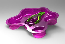
The product contain 5 prunes and is accompanied by a set of child-friendly tongs. This interactive approach empowers children to independently select and enjoy their prunes, fostering a sense of fun and control over their healthy snack.
By using the tongs, direct contact with the prunes is minimized, contributing to a cleaner and more appealing eating experience.
Prototyping


Max was the character created who demonstrates vitality and strength after eating prunes, which conveys a positive message to children.


Testing/Validiting
The packaging and tongs were prototyping until the size and shape were appropiate for the target.
Usability test were conducted to make sure the design met the children expectations and could guarantee an interactive and funny experience for them.


The project ended with a high-fidelity prototype and the highest score in the industrial design program.
After graduating, we competed in design and innovation competitions, but since it was a food product that involved complex health processes, we paused the project and each of us followed our own professional paths.
Anyway, it is one of our best design project processes and a role model for our current projects. We will always remember how excited we felt when we found all the answers through research, observation, methodology, and understanding users' needs and behaviors.
High Fidelity Prototype