
GoFlight
Flight booking website
Project Type
UX Design Project
Date
Aug. 2024 - Mar. 2025
Location
Dublin, Ireland
As part of my UX Design Institute coursework, I designed a high-fidelity prototype for a flight selection experience on a booking website. My process prioritized a user-centered approach, which included iterative usability testing, and was complemented by in-depth competitive analysis to uncover critical insights and inform design decisions that avoid common pitfalls and integrate best practices.
Context

Research Block
Objectives
Identify best practices and usability issues in competitors' flight selection interfaces.
Identify Key User Pain Points and Frustrations within existing Flight Selection Processes
Determine User Expectations and Mental Models for an seamless flight selection experience
Uncover Opportunities for Innovation and Differentiation in the flight selection process
Research Plan
To achieve these objectives, I undertook a Competitive Benchmark analysis, using Nielsen's 10 usability heuristics as a guide, identifying common issues and best practices within the industry. I then conducted and analized Usability Tests from different airlines, paying attention to interaction and navigation problems users encountered, as well as their pain points and expectations during the booking process.
These findings, along with data I gathered for Affinity Map, were further enriched by conducting a User Journey analysis, specifically identificating user emotions and areas of frustration throughout their experience. All this information was then synthesized to highlight areas for improvement across various categories, ultimately leading to actionable insights.
Competitive Benchmarker
The primary objective of this analysis was to identify established best practices and conventions, as well as common usability issues in the industry.
My evaluation focused on the flight selection process, from the initial interaction with the search bar to flight and fare selection, and finally, booking confirmation.
Below is an analysis of three direct competitor airlines and one indirect competitor in hotel bookings.
Ryanair is a major European low-cost airline founded in 1985, headquartered in Dublin.
Lufthansa is a German aviation group, also known as the Lufthansa Group, with global operations.
Iberia is the flag carrier airline of Spain, based in Madrid. It's a major player in the EU market.
Mr & Mrs Smith is a travel club and booking platform specializing in hand-picked boutique and luxury hotels.
Ryanair Analysis

Home Page

Home Page
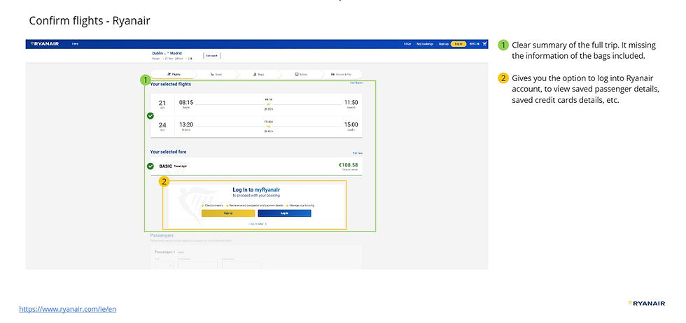
Review and Confirm
Home Page
Strenghts
-
The platform demonstrates focus on low prices. It offers useful features like an innovative "not sure where to go" tool, robust default/airport recognition, and effective error prevention (e.g., displaying only available locations).
-
The booking process benefits from clear status steps, simultaneous display of flight prices for an overall view, an intuitive and quick flight selection interface, an easy-to-read fare table, and convenient account login for saved details.
Weaknesses
-
An overwhelming, marketing-heavy homepage.The footer is poorly organized and provides minimal, hard-to-find help text.
-
The booking flow is hampered by confusing date selection (no confirmation, confusing carousel), small sort option, no showing filters and a critical missing back button that forces restarts.
-
Undersized shopping cart, deceptive promotion of higher fares, small text for crucial price details, and a lack of upfront transparency regarding passenger count.
Iberia Analysis


Strenghts
-
Strong brand consistency and efficiency for certain functions, using interactive pop-ups, maintaining focus by overshadowing the rest of the site incorporating clear "x" and CTA buttons.
-
Support features include a chatbot ("Ibot") and a prominent "Helpdesk" logo in the menu. The site also shows good user feedback and error recovery, providing clear explanations and guidance to return to the tasks.
-
The interface uses airline logos and offers well-explained filter options. The fare selection flow is well-informed, and the total price for passengers is clearly displayed. An innovative "share with friends" feature is present.
Weaknesses
-
Significant issues with slow loading speeds, heavy information, leading to multi-step and complex task completion. The chatbot is limited and prone to errors. City dropdowns displaying non-operational locations and poor organization of city selections that don't follow standards.
-
No option to clear/reset recent searchs and users must select "round trip" before calendar interaction. Lack of detailed information for features and extra clicks to know stops details.
-
Fare selection includes an extra steps unclear calls to action, and a poorly designed fare table requiring extensive scanning.
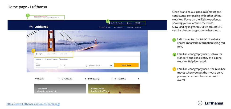
Lufthansa Analysis


Strenghts
-
It effectively uses flight alerts and provides accessible help within the main menu. Notable features are the interactive pop-up for check-in and flight status, streamlining the process.
-
The clear and well-organized footer also transparently lists payment methods and partnerships.
-
The calendar functionality is strong, allowing easy switching between one-way and round-trip, highlighting the cheapest prices, it provided a confirmation button and the flexibility to change currency in different stages of the process.
Weaknesses
-
Flickering header, unclear icons, overwhelming texts and obtrusive banners. Critical slow loading pages.
-
It presents a global list that includes non-operational airports. The calendar has usability issues, displaying unclear prices and requiring users to manually check passenger selected.
-
Filtering options are buggy, and the fare comparison is poor with unclears table. Critical booking errors result in "no flights available" pages post-confirmation and modifying flights is frustating, as users must re-enter details without assurance of finding alternative options.
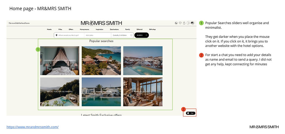
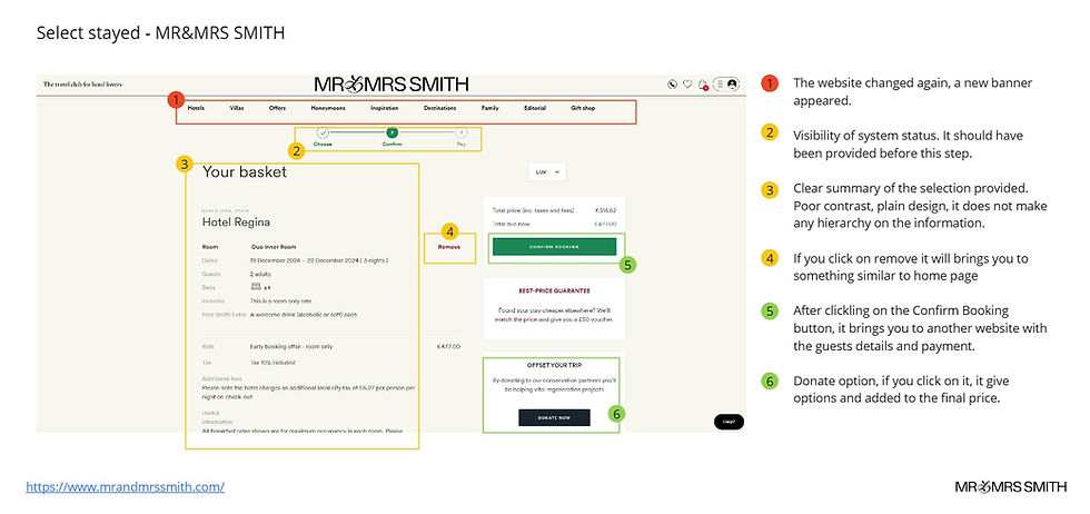
Mr & Mrs Smith Hotel Analysis

Strenghts
-
The website features a minimalist design with well-organized carousels and attractions. It builds transparency through a Trustpilot connection and important information highlighted. The status system is effective, notably using bright pop-ups for user focus. Useful clear button available in calendar.
-
Filters and sort options are clearly presented on the left, alongside currency change functionality. A convenient "come back" button allows easy detail modification, and date changes are simple in later stages.
Weaknesses
-
The website's chat feature demands personal details upfront, creating friction. Destination dropdowns lack options, and the absence of a checkout date confirmation button leads to errors, requiring users to manually verify the number of nights.
-
The "help" button redirects users to an external site, forcing them to restart inquiries and re-enter personal information. Overall, the site suffers from inconsistent menu bar behavior and poor information recall for user selections.
SWOT Analysis
After analyzing the competition, I organized the key findings into the following chart, which groups together strengths, identifies weaknesses to avoid in a new flight search website, highlights crucial UX design opportunities in existing flight navigation, and pinpoints areas where new features and interactions can be innovatively addressed, all while considering potential external threats to the user experience.

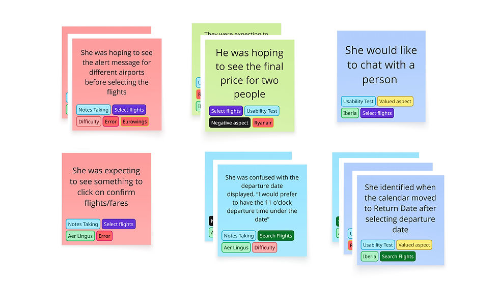
Competitors Usability Test
This research presents key insights from usability testing conducted on competitor airline websites. The primary objective was to observe and document user interactions with the online flight booking process, focusing on the selection of round-trip flights. By analyzing participants' experiences navigating similar scenarios on these websites, my aim was to identify usability issues, areas of user frustration, and gather insights into user mental models and expectations.
I highlight the main Usability Issues and User Expectations identified and that are viable to adress in this project.
Te competitors analized were:

Usability Test Conducted - Ryanair
Usability Issues


-
Common problems included poor feedback, leading to repetitive actions and a slow process. Confusing interactions, especially with pop-ups, calendars, and city selection, caused frustration. Many features were unused because they were difficult to understand or find.
-
Other issues were a lack of personalization (the website didn't recognize user data or preferences) and poor visual design. Ambiguous information about flight details, fare benefits, and baggage policies often led to unwelcome surprises at the end of the booking process.
User Expectations/Behaviours
-
Users want a clear and trust experience, with key information like stops, flight durations and fare differences presented upfront. This information should be timely and easy to understand.
-
Before confirming a booking, users expect to review a good flight summary. They would like a simple way to share flight details with others—a process they currently hack together using WhatsApp screenshots. When they need support, they prefer speaking with an agent instead of a chatbot.
-
Although many users are not currently using filters and other features, they express a willingness to do so in the future if they better understood the benefits.

Analysis Block
Affinity Diagram
The data collected from the Competitive Benchmark and Usability Testing were organized into an Affinity Diagram, which proved instrumental in identifying patterns and key insights related to common user frustrations and future design opportunities.

Part of Affinity Diagram - Miro
User Journey

Understanding User Emotions and Key Problems
The journey begins with feelings of excitement and hope for an upcoming trip. This initial motivation is strong, especially as travel plans start to feel real.
However, the process soon becomes a chore, as users are forced into price comparisons across multiple websites. This is compounded by the stress of coordinating with others and minor website errors that cause confusion during crucial steps like selecting a destination and date.
The peak of their frustration comes from confusing fare options, hidden costs, and aggressive upsells, which leaves them feeling distrustful and even deceived.
Despite these challenges, moments of excitement return when a reservation is finally confirmed. Yet, this can be short-lived. A final lack of transparency or unexpected details like stopovers can force them to restart the entire process, replacing their excitement with a deep sense of disappointment and frustration.
Part of User Journey Analysis - Miro
Key Insights
The research yielded six key insights that will inform this project's design recommendations, which will be finalized to create the initial sketches and subsequent high-fidelity prototypes

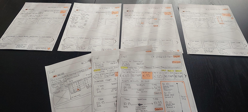
Prototyping
Wireframes
These wireframes are a direct result of my user research, where I discovered that a great booking experience must be both efficient and trustworthy. With that in mind, I have designed a solution that prioritizes clarity and simplicity.
The design provides clear, immediate feedback while eliminating distractions to keep the user focused on their task. I have also focused on following established design conventions and using familiar language to create a comfortable experience. By ensuring important information is visible and easy to find, I am building a product that earns user trust and culminates in a smooth experience.
Finally, I have made accessibility a priority by utilizing high-contrast colors and bold fonts to ensure the experience is as seamless as possible for everyone.
Prototypes
Home Page
The home page proposal is designed with a focus on both accessibility and clear information hierarchy.
Key Improvements:
-
Enhanced Visual Clarity: We utilize strong contrast and bold typeface to ensure legibility and guide the user's eye efficiently.
-
Reduced Cognitive Load: Addressing user feedback about feeling overwhelmed, the design significantly reduces the information presented on the home page to the absolute essentials.
-
Familiarity Meets Innovation: While maintaining the conventional flight search bar structure, iconography, and concepts found on established flight websites, the proposal distills these elements into a streamlined and novel presentation.
-
Constant Support: Help and Support resources are made easily and consistently accessible to the user at all times.
This approach ensures the user can quickly and confidently initiate their flight search without being distracted by unnecessary data.
Notes Taking

Search Flight Bar navigation
The design of the flight search bar is centered on a common, efficient flow that minimizes the number of clicks while consistently maintaining user control to prevent navigation errors.
Key Search Features:
-
Smart Origin Selection: The bar includes auto-recognition of the origin city. This, combined with showing only the destinations where the airline operates, builds user trust and prevents downstream booking errors.
-
Error Prevention & Guidance: Clear alert messages are implemented to guide the user on how to proceed, ensuring a smooth and error-free experience.
-
Calendar Flexibility: The calendar feature now includes a prominent "One-Way" toggle. This provides users with the immediate flexibility to adjust their search type without leaving the selection view.
-
Flexible Data Entry: Recognizing diverse user preferences, users have the option to type in or manually enter dates, giving them flexibility in how they interact with the calendar fields.
This optimized flow ensures the search process is both fast and reliable, meeting user expectations for a smooth booking experience.
To enhance the user experience, we've implemented smart options like "Recent Searches," but we've prioritized user control above all.
-
Recent Searches: Users will see their previous searches as convenient suggestions, but they retain the complete power to select them or ignore them.
-
Clear Selection: A straightforward "Clear Selection" option is readily available, allowing users to quickly start their search from scratch if they choose.
Flight Results & Selection
The Results Page is designed to provide immediate clarity and complete transparency, ensuring users have all the necessary information to make a confident decision.
Key Features and Rationale:
-
Trip Summary: The page immediately shows both the departure and return flights along with the final trip price. Crucially, the price is clearly indicated as "per person" to avoid any unpleasant surprises during checkout.
-
Prioritized Information: We prioritize showing the most relevant flight information upfront. However, users can access more granular details (e.g., layovers, aircraft type) via a non-intrusive pop-up window.
-
Fare Options: Fare comparisons follow the industry convention of a simple, side-by-side comparison table. The focus is on clarity, avoiding overwhelming users with excessive details.
-
Pricing Flexibility: Prices for surrounding days are easily accessible, allowing users to quickly assess potential savings by adjusting their travel dates.
-
Consistent Interaction: The entire results page maintains an overall consistent interaction pattern, ensuring a predictable and intuitive experience across all elements.
Notes Taking
